728x90
'개인 > 관심 자료' 카테고리의 다른 글
| 30가지 개인 자기소개서 사이트 (0) | 2011.05.26 |
|---|---|
| 함께 쓰면 실패하지 않는 영문 폰트조합들 (0) | 2011.04.27 |
| ppt발표 영감 (0) | 2011.03.16 |
| 로고 디자이너 70명의 트위터 (0) | 2011.03.16 |
| 디자인 자료 다운로드 가능한곳 영감 + 소스 등등 메거진도 있음 (0) | 2011.03.06 |
| 30가지 개인 자기소개서 사이트 (0) | 2011.05.26 |
|---|---|
| 함께 쓰면 실패하지 않는 영문 폰트조합들 (0) | 2011.04.27 |
| ppt발표 영감 (0) | 2011.03.16 |
| 로고 디자이너 70명의 트위터 (0) | 2011.03.16 |
| 디자인 자료 다운로드 가능한곳 영감 + 소스 등등 메거진도 있음 (0) | 2011.03.06 |

"About me" pages have the ability to engage and inform your site visitors in a personal and friendly way. For web professionals, our "About me" page can be critical in establishing a true connection with potential clients, and it can set us apart from a sea of other designers and developers.
For different types of websites, keep in mind that the About page could be structured differently. For example, an About page for a blog or news site can be vastly different when compared to the same page for a portfolio website.
In this collection, I’ve rounded up 30 excellent "About me" pages from the web portfolios of amazing designers, artists, illustrators, and developers. Enjoy!
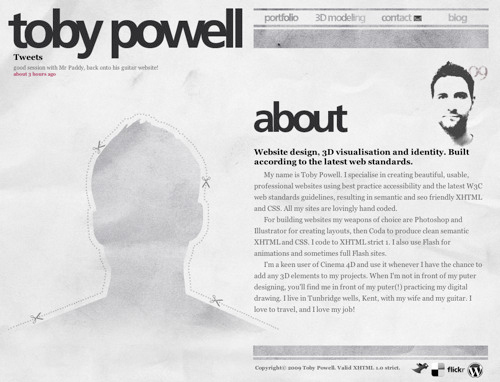
An interesting use of a cutout/silhouette sets this designer’s About page out from the crowd. A halftone self-portrait and a concise biography of the site owner rounds out this web page’s design.
Most designers use a professional headshot photo of themselves on their About pages, but this designer from Sweden presents an interesting and unique perspective with his overhead shot. Bold typography draws you in to create added visual interest.

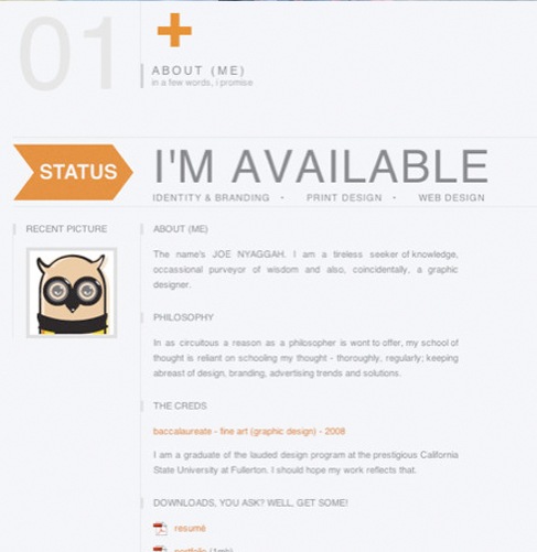
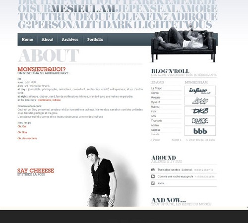
The designer used a grid layout in the layout of his About page. Contemporary colors inform you of the designer’s style, while a status message of his availability to take on new projects makes it clear to prospective clients whether he’s available or not.
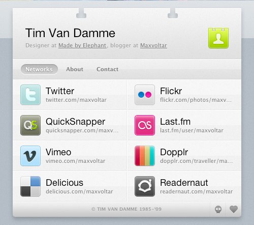
A unique and effective way of organizing your personal information on the web is to create an online business card (vCard). In doing so, we learn who the designer is, other places to connect with him, and how to get in touch with him.
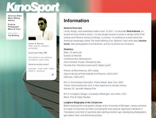
The About page for James A. Reeves is simple and modular, allowing for the large-scale photography in the background.
The artistic design of Janis’s website is very captivating. It gives you a glimpse into the designer’s personal aesthetic style, while supplying the information you need to hire him for your next project. The use of large photography can leave a lasting impression on the visitor if done effectively, as shown in this About page.

Here’s another example where the designer used a self-portrait in a unique and engaging way. Including a large self-portrait on your site gives a potential client a real person to relate with.

Jared Christensen used a humorous, catchy self-portrait on his About page to not only allude to his sense of humor, but also allow the client to see his creative side a little more personally.

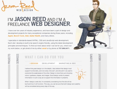
Jason Reed uses a nice illustration of himself in his About page. The use of an illustration is another way to grab the visitor’s attention and add a more character to your About page.
This designer organized his credentials in an easily digestible format. Large photography offsets the information and gives you an idea of the site owner’s style and influences.

On this website for a design studio, information is organized efficiently, both giving you an idea of their services while presenting attributes of the designers behind the company.

Here’s another striking About page. As you can see, the design is simple, but fun and illustrative.

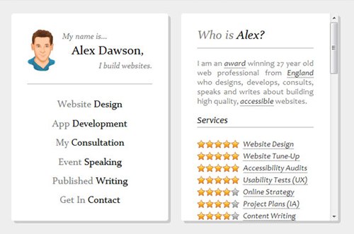
Alexander Dawson (a Six Revisions writer) presents his About page in a very efficient, functional manner. From looking at his credentials, you get a quick overview of who he is, what he does, and the services he excels in. It’s really all you can ask for from an "About me" page, right?
Through the use of a grid layout, Adam Dannaway achieves a simple, straightforward About page that also gives you an idea of his skills, illustrated as graphs.

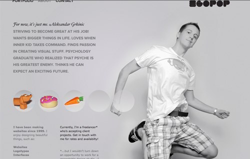
The About page for egopop presents a large-scale photo of the designer as well as a simple biographical statement about himself and his history as it relates to his profession.
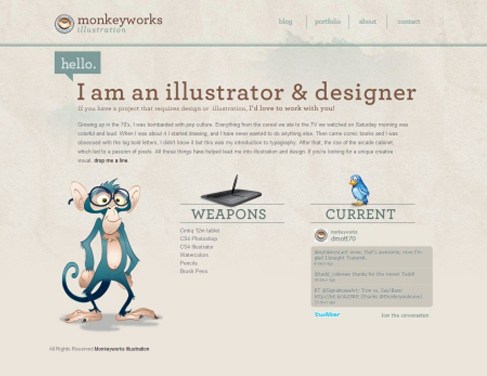
Monkeyworks uses a clean, structured layout on their About page. Not only are the illustrations captivating, but the typography stands out and the graphics used add a nice touch.
Great use of typography is what stands out in this "About me" page. Not only does the type make the page easy to read, the grid layout increases readability as well.

The designer took their About page to the next level by superimposing their face on Mount Rushmore. Tastefully done, this tactic adds a unique and memorable visual to an otherwise straightforward page.

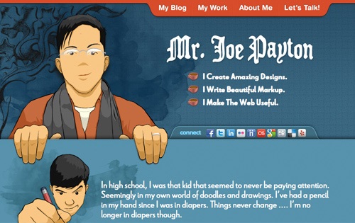
The About page of Joe Payton presents a short bio about him in a beautifully laid out format. The designer also presents information for following him on various social networking sites.
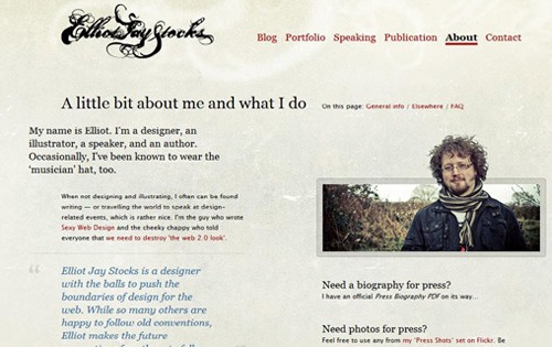
The About page of Elliot Jay Stocks is laid out rather simply, but the typography is carefully thought-out and makes you want to explore this designer’s work further. The designer, who is also a speaker and author, presents you with links to pertinent information related to his professional activities.
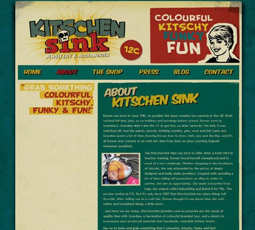
The compelling website for Kitschen Sink made me want to explore the About page. I found out that they’re a jewelry and accessories shop and I learned the history behind the company. Although it’s laid out very simply, captivating branding led me to the About page through curiosity.
Matt Mullenweg sets the backdrop for his About page on a highly textured background. These visual layers compelled me to read more about the founder of WordPress.

This beautiful About page features animations and depth to draw the visitor in. Clear typography and a monochromatic color scheme set this About page apart.

This designer’s About page is really simple and straightforward. It includes a short bio, links to relevant info, and her library. It’s always the neatly designed pages that attract me the most.

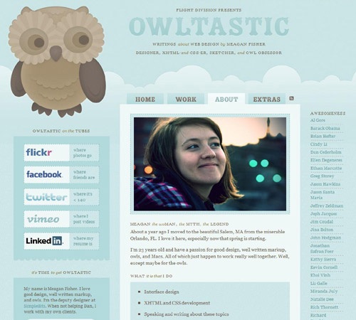
This beautiful About page of designer Meagan Fisher lets you know all the pertinent information about her and the services she provides. Included are links to social networks and other affiliated websites, all organized into a clean and inviting format.
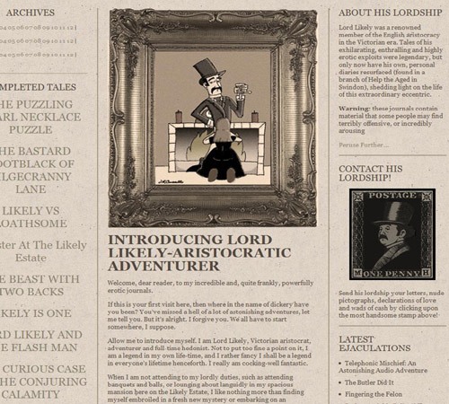
This compelling About page’s character is what draws the visitor in. Inspired by Victorian-era design, the designer implemented old-world style in creating a unique and professional page that serves as an introduction to himself.

This unique About page presents a timeline of the site owner’s life — from birth to his projected death.
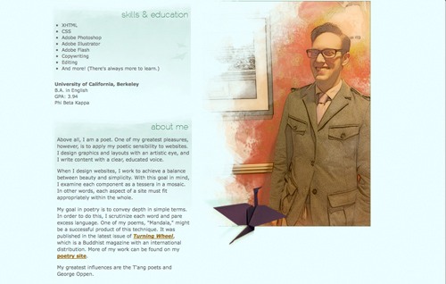
The beautiful watercolor illustrations grabbed my attention on this website. As you can see, his About page is laid out very simply and elegantly. We get a sense of his design influences, on top of his skills and education, through this clean and straightforward approach.
Large-scale photography is what sets this "About me" page apart. The page is laid out in a clear format, providing information about the designer and where he can be found.
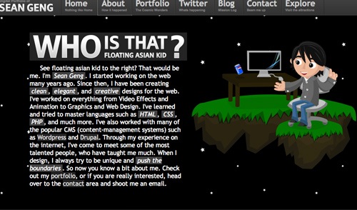
The interaction on this website intrigued me enough to explore its About page. You can see from his short biography what the designer specializes in and how to reach him.
| 빛과 어둠의 이해 도영상 (0) | 2011.09.25 |
|---|---|
| 함께 쓰면 실패하지 않는 영문 폰트조합들 (0) | 2011.04.27 |
| ppt발표 영감 (0) | 2011.03.16 |
| 로고 디자이너 70명의 트위터 (0) | 2011.03.16 |
| 디자인 자료 다운로드 가능한곳 영감 + 소스 등등 메거진도 있음 (0) | 2011.03.06 |
|
|
| 빛과 어둠의 이해 도영상 (0) | 2011.09.25 |
|---|---|
| 30가지 개인 자기소개서 사이트 (0) | 2011.05.26 |
| ppt발표 영감 (0) | 2011.03.16 |
| 로고 디자이너 70명의 트위터 (0) | 2011.03.16 |
| 디자인 자료 다운로드 가능한곳 영감 + 소스 등등 메거진도 있음 (0) | 2011.03.06 |
| 30가지 개인 자기소개서 사이트 (0) | 2011.05.26 |
|---|---|
| 함께 쓰면 실패하지 않는 영문 폰트조합들 (0) | 2011.04.27 |
| 로고 디자이너 70명의 트위터 (0) | 2011.03.16 |
| 디자인 자료 다운로드 가능한곳 영감 + 소스 등등 메거진도 있음 (0) | 2011.03.06 |
| 디자인 잡지에 실린 "함께 쓰면 실패하지 않는 영문폰트 (0) | 2011.02.27 |
Twitter is growing daily. Personally I use twitter for promotion and networking with the people in my industry. As I gain and lose followers it becomes harder to figure out who is who. I’ve compiled a list of the logo designers that you should probably be following if you currently don’t. To make things easier for you just click on the picture and the designers twitter page will open, in which you can follow that specific person. Now for all you lazy people like me, all you have to do i just follow the list of logo designers We have created.
Please keep in mind we don’t know of every great logo designer that exists, so if we happen to have missed you just comment below with a link to your portfolio. We will take a look and add you to the list.


![]()


![]()


![]()


![]()

![]()
![]()


![]()


![]()
![]()
![]()
![]()

![]()


![]()


![]()
![]()


![]()
![]()

| 함께 쓰면 실패하지 않는 영문 폰트조합들 (0) | 2011.04.27 |
|---|---|
| ppt발표 영감 (0) | 2011.03.16 |
| 디자인 자료 다운로드 가능한곳 영감 + 소스 등등 메거진도 있음 (0) | 2011.03.06 |
| 디자인 잡지에 실린 "함께 쓰면 실패하지 않는 영문폰트 (0) | 2011.02.27 |
| 15가지 이력서 디자인 잘 만드는법 팁과 글모음 (0) | 2011.02.27 |
| ppt발표 영감 (0) | 2011.03.16 |
|---|---|
| 로고 디자이너 70명의 트위터 (0) | 2011.03.16 |
| 디자인 잡지에 실린 "함께 쓰면 실패하지 않는 영문폰트 (0) | 2011.02.27 |
| 15가지 이력서 디자인 잘 만드는법 팁과 글모음 (0) | 2011.02.27 |
| 5가지 클라이언트 설득하기 프로젝트 로고 프레젠테이션 (0) | 2011.02.19 |
|
|
| 로고 디자이너 70명의 트위터 (0) | 2011.03.16 |
|---|---|
| 디자인 자료 다운로드 가능한곳 영감 + 소스 등등 메거진도 있음 (0) | 2011.03.06 |
| 15가지 이력서 디자인 잘 만드는법 팁과 글모음 (0) | 2011.02.27 |
| 5가지 클라이언트 설득하기 프로젝트 로고 프레젠테이션 (0) | 2011.02.19 |
| 창의적인 이력서 디자인 사례들 (0) | 2011.02.19 |
Have a great resume, will help you to get a job. Because it can attract people first impression then they will look your portfolio, otherwise If your resume is poorly presented, chances are that nobody will bother to read it.
In this article, we’ve collected 15 very useful design tips articles that can help you to create a great resume.

By Kat Neville
The economy is bad. No one’s job is really 100% safe, so it’s time we all bucked up and got our recession bags packed (just in case!). Your portfolio is already gorgeous, but have you created a drool-worthy résumé?
This flimsy one-page document is more important than many people think: the résumé is the first portfolio piece that potential employers see, and if they’re not impressed, chances are they won’t look at the rest of your portfolio.

By Kristen Fischer
why would you need a resume? Two reasons: Resumes can help you get freelance gigs and they offer a quick profile so potential clients can assess you.
That said, I realize many freelancers don’t know the new rules of resume writing. And yes, there are some new tricks. So I’ve put together this three-part guide to help you compile a winning resume, even if you never intend on applying for another job again.

By Kristen Fischer
If you’re hanging in with me and considering having a resume—yes, even though you freelance—the next step is to make sure your resume is written well.
Here are some tips to help your resume stand out when it comes to wording and spreading the word about what you have to offer!

By Jacob Share
Many companies and recruiters prefer the simplicity and speed of one page resumes. As a designer, how can you have maximum impact with only a single sheet of paper? The answer…

By David Airey
Lee Newham is was a senior designer at London-based consultancy P&W. He received three or four CVs (resumés) every day, and here he offers some tips on how graphic designers can get to the top of the pile.

By You The Designer
I have talked with many art directors, designers and read an array of articles on the topic of resume design and you would be surprised at how the smallest glitch could sink your chances. Below I will go over everything you need to know regarding putting together a successful graphic design resume.

By Eye Magazine
Here are some simple ideas / rules that I think will give you the edge.

By Periscope
Whatever your situation or frame of mind, we thought you might appreciate a bit of friendly advice. We never write CVs for you, but we can give you a few rules of thumb which might just help you get started…

By The Creative Group
A good resume is hard to find, but questionable resumes aren’t such a rarity. In fact, in a recent survey by our company, hiring managers provided some examples of unusual—and less than effective—tactics job seekers have used to grab their attention.

By The Creative Group
The following tips can help you create a document that will accentuate the positive:

By Chanpory Rith
When it comes to résumés, both non-designers and professional designers commit some almost unforgivable sins. Here are the 7 deadly sins of résumé design and how to repent:

By Tayyab
So what is a good CV? Here, you’ll learn the two methodologies of creating a resume in two sections “What to Write” and “How to Design”.
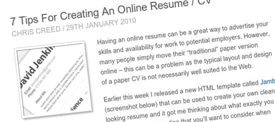
By Chris Creed
Having an online resume can be a great way to advertise your skills and availability for work to potential employers. However, many people simply move their “traditional” paper version online – this can be a problem as the typical layout and design of a paper CV is not necessarily well suited to the Web.

By infinete ideas
If your CV is poorly presented, chances are that nobody will bother to read it. Here’s some tips on how to present your CV both professionally and attractively.

By Trish Mullen
This article is aimed at helping those of us who struggle constantly with writing that winning resume. First of all, it is not the resume that gets you that dream job; that is down to YOU, the winning resume will only get you to the interview stage. In all my experience, I have never known anyone get a job straight off the back of a resume.
| 디자인 자료 다운로드 가능한곳 영감 + 소스 등등 메거진도 있음 (0) | 2011.03.06 |
|---|---|
| 디자인 잡지에 실린 "함께 쓰면 실패하지 않는 영문폰트 (0) | 2011.02.27 |
| 5가지 클라이언트 설득하기 프로젝트 로고 프레젠테이션 (0) | 2011.02.19 |
| 창의적인 이력서 디자인 사례들 (0) | 2011.02.19 |
| 한국사람이 창의적이지 못한 이유... (0) | 2011.02.18 |
Presentation takes a big part in getting approval from your client. If your client has already liked your design, a little extra effort in presenting the design will help the client make his/her decision. The key here is to help the client to see your design applied on the chosen medias, as if they were already printed out. For an example, a picture of a business card held by our hand looks more appealing than a picture of the flat business card by itself. In this tutorial, we’ll show you how to present your logo design in 5 different ways.
Here’s the example logo was used for this tutorial:

Take a picture of your hand holding a card with your logo design on it. You can always use the same picture for other logos in the future.

Place your logo into the card in Photoshop.

Ctrl+T to distort and skew the logo to fit the perspective of the card and scale the logo into the right size.

Clients need to see that the logo would work on dark background as good as on white background. For dark background, make a 100% black background in Photoshop and copy the logo into another layer.

Use 95% black for the highlight color in radial gradient, set the somewhere near the logo icon as the center.

Use 15% black for the shadow gradient in the logo.

Make a new layer on top of the logo layer. With the elliptical tool, make an ellipse on the logo, where you want the shadow to be. Use the gradient of 50% black from top.

Press Ctrl and click on the logo layer thumbnail to select the logo. Ctrl+Shift+I to select reverse. Click on the shadow layer and press Del or backspace button to delete the area outside of the logo.

Last Step is to make shadow under the logo by right-clicking the logo, choose Blending Options on the menu, Drop Shadow, adjust the distance of the shadow to 2 or 3 px, depends on your size of the file and your preference.
Choose a wood texture background you like, smooth texture works better for logo bevel and emboss.

Copy the logo to another layer and fill it with brown color picked from the background.

Multiply the logo layer on top of the wood texture layer. The color will look darker like below. Right-click on the logo layer and choose Blending Options, Inner Shadow. You might wonder why I don’t use Bevel and Emboss option there, you can always try it and compare the results. Personally I prefer a manual Bevel and Embossing because the light and shadow would look more real.

Duplicate the logo layer into two different layers. Black on top of white logo layer, move the black logo slightly right and down.

Hold Ctrl and click on the black logo to select its outline. Then click on the white logo layer and delete the selected area, leaving only the white edges. Now choose the layer effect overlay, adjust the position until the lighting looks right.

Get a picture of the company building which logo you’re designing. Open it in photoshop, copy the logo into a new layer.

Photo credit: iStockPhoto.
Apply 30% black of gradient to the logo. Add Drop Shadow. And here it goes.

Photo credit : iStockPhoto.
Choose a picture of the product and set as a background. Apply subtle Outer Glow on the logo to make it stand out from the background.

Photo credit : iStockPhoto
Presenting your logo designs to clients on signage, a business card or even a piece of wood will: 1) show how well it works in ‘the real world’ and 2) make the logo more appealing to your client. Remember, presentation is critical when pitching on freelance logo jobs and logo design contests – it will help you win more work!
| 디자인 자료 다운로드 가능한곳 영감 + 소스 등등 메거진도 있음 (0) | 2011.03.06 |
|---|---|
| 디자인 잡지에 실린 "함께 쓰면 실패하지 않는 영문폰트 (0) | 2011.02.27 |
| 15가지 이력서 디자인 잘 만드는법 팁과 글모음 (0) | 2011.02.27 |
| 창의적인 이력서 디자인 사례들 (0) | 2011.02.19 |
| 한국사람이 창의적이지 못한 이유... (0) | 2011.02.18 |
When applying for a job, a designer’s résumé is of utmost importance. This is precisely what should be attention-grabbing and creatively designed. This portrays the level of creativity and also aids in standing out from the rest who also happen to be applying for the same position. We hope that these creative résumés will inspire and encourage you to think out of the box and redesign your application papers with sucess.
To help you get ready for your job interview, you can read here to find out how to prepare well. Don’t forget to stay creative. Good luck!
Curriculum Vitae by Jonny-Rocket
Attraction is the standard. This quote fulfills the requirements of attraction and represents a gorgeous work of art:

Matthew Villalovos
What a catalogue of foods. Are you inspired from it? Of course this menu style résumé is full of lavishness and offers a thorough presentation:

Francis Homo
This unique style of a résumé shows the human mind supremacy of thinking out of the box. If truth be told this unique résumé is full of smart veins and fresh blood:

Chuck D Lay Résumé
Incomparable style of work which shows the worth and skills of the artist:

Joe Kelso presents…!
Here the artist presents a wonderful job hunting style in this résumé. This unique kind of résumé is a masterpiece of work:

Résumé by Pau Morgan
Creatively designed résumé that looks eye-catching and attracts the whole attention of all:

Google Earth Résumé
This is a Google earth oriented résumé. It is spread on the earth map and shows the density around the globe:

Résumé by Arianedenise
What an album! This best style résumé is a masterwork of stylish thinking:

Wakuda Studio Résumé
This is a Wakuda Studio résumé and shows the irresistible uniformity of military cloak. Looks very appealing:

Visual Résumé
Infographics are the used most when trying to portray smart representations. In this résumé an infographic is used to show all the contents in an instant:

Résumé by Adam Stephenson
This résumé has been created by Adam Stephenson and shows the beauty of vintage style:

Résumé by Anna Yenina
This is a combination of affectionate letters and presents the lovely thoughts of artist in a visual nutshell:

Personal Résumé Draft by Steven Duncan
This is one of the most creative styles of creating your résumé. This elegant résumé represents the artistic approach of the artist and gives you the idea what level of creativity you can expect from him:

Curriculum Vitae by 802.11
A unique way to describe the whole professional life and growth in a visual nutshell. This resume not only gives the employer visual treat but also inform him about the learning ladder of the artist he is going to hire:

Work Résumé
A simple yet very comprehensive and detailed résumé that lets the employer know all the capabilities and skills of the designer. This résumé also demonstrates the level of creativity the artist possesses:

Tudor Deleanu’s Résumé
This is the perfect example of an eye-catching and attention grabbing résumé. This résumé represents the life of the artist in different blocks that is easy for the employer to skim through:

2004 Résumé
Machines embody the perfection and this résumé and shows the employer that s/he can expect nothing else but initiative ideas from the artist:

Stepl Am Knotts
Another visually compelling, detailed artistic résumé explaining the key attributes of the artist:

Origami Résumé
This origami résumé looks visually stunning representing the irresistible compactness of the artist throughout their work:

Joshua Drummond
This comic book résumé is a unique way to produce the simplicity of style and shows the best depiction in its kind:

F. J. Garcia
This is a comic strip résumé that leads to Spanish art. The artist made good effort to show his denseness:

Visual Résumé by Oona
This is a rough draft résumé on paper representing the creative approach and innovative thinking of the artist:

Sean McNally
This masterpiece résumé is created in gaming character style and shows the creative connotation of the artist:

Federico Moral
Creativity is the most significant part of any design. This unique résumé shows the creativity of the artist. This is truly a work of creativity:

Jonathan Kaczynski
This transit style map is very stylish and shows the artist know-how about the transit significance. This precise résumé illustrates the transit of life as well:

Facebook Replica Résumé
What a unique format that is full of style and loveliness. This facebook replica résumé is a powerful presentation of the artist’s approach of the candidate:

T-shirt Résumés
Here is a really artistic approach.In this résumé the artist has created a unique style of representation:

Life Chart Résumé
The artist shows his worth in shape of a chart. What a movement! You cannot ignore it at all:

Curriculum Vitae by Mistis
No escape from vintage! This vintage style résumé is best for hunting any job and shows the artist’s density as well:

Urban Art Résumé
This urban art résumé is a masterpiece which is exactly an album of the artist’s potentials as well:

H. SercanTunali Résumé
The Earth is round and if someone keeps trying to find a job, he will meet his success again and again. This global representation of a résumé is a masterpiece:

Aamir Shah Résumé
What a style of mechanic thinking. This beautiful résumé is a folder which is a great approach by the artist:

Jean Francois Résumé
A gorgeous design that shows the beauty of the thoughts by its creator:

Christiano Pires
A résumé which has been created with the help of personal belongings and shows the abilities of the artist:

Curriculum Vitae by Fransanchez
Power of red can be demonstrable and so the artist produces a sharp colored résumé to hunt the job:

2009 Résumé SID Santos
This unique style résumé is created on a paper cup and illustrates the diversity of the artist’s mind:

Résumé Passport
A passport styled résumé which is full of contents and shows the concrete official style of work:

Résumé by Kelly Haller
What a classy résumé! One can’t ignore this unique and creative style:

| 디자인 자료 다운로드 가능한곳 영감 + 소스 등등 메거진도 있음 (0) | 2011.03.06 |
|---|---|
| 디자인 잡지에 실린 "함께 쓰면 실패하지 않는 영문폰트 (0) | 2011.02.27 |
| 15가지 이력서 디자인 잘 만드는법 팁과 글모음 (0) | 2011.02.27 |
| 5가지 클라이언트 설득하기 프로젝트 로고 프레젠테이션 (0) | 2011.02.19 |
| 한국사람이 창의적이지 못한 이유... (0) | 2011.02.18 |
 by 앗뜨거 |
||


|
| 일 | 월 | 화 | 수 | 목 | 금 | 토 |
|---|---|---|---|---|---|---|
| 1 | 2 | 3 | 4 | 5 | ||
| 6 | 7 | 8 | 9 | 10 | 11 | 12 |
| 13 | 14 | 15 | 16 | 17 | 18 | 19 |
| 20 | 21 | 22 | 23 | 24 | 25 | 26 |
| 27 | 28 | 29 | 30 | 31 |

