728x90
'개인 > 관심 자료' 카테고리의 다른 글
| 30가지 개인 자기소개서 사이트 (0) | 2011.05.26 |
|---|---|
| 함께 쓰면 실패하지 않는 영문 폰트조합들 (0) | 2011.04.27 |
| ppt발표 영감 (0) | 2011.03.16 |
| 로고 디자이너 70명의 트위터 (0) | 2011.03.16 |
| 디자인 자료 다운로드 가능한곳 영감 + 소스 등등 메거진도 있음 (0) | 2011.03.06 |
| 30가지 개인 자기소개서 사이트 (0) | 2011.05.26 |
|---|---|
| 함께 쓰면 실패하지 않는 영문 폰트조합들 (0) | 2011.04.27 |
| ppt발표 영감 (0) | 2011.03.16 |
| 로고 디자이너 70명의 트위터 (0) | 2011.03.16 |
| 디자인 자료 다운로드 가능한곳 영감 + 소스 등등 메거진도 있음 (0) | 2011.03.06 |

"About me" pages have the ability to engage and inform your site visitors in a personal and friendly way. For web professionals, our "About me" page can be critical in establishing a true connection with potential clients, and it can set us apart from a sea of other designers and developers.
For different types of websites, keep in mind that the About page could be structured differently. For example, an About page for a blog or news site can be vastly different when compared to the same page for a portfolio website.
In this collection, I’ve rounded up 30 excellent "About me" pages from the web portfolios of amazing designers, artists, illustrators, and developers. Enjoy!
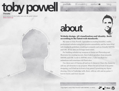
An interesting use of a cutout/silhouette sets this designer’s About page out from the crowd. A halftone self-portrait and a concise biography of the site owner rounds out this web page’s design.
Most designers use a professional headshot photo of themselves on their About pages, but this designer from Sweden presents an interesting and unique perspective with his overhead shot. Bold typography draws you in to create added visual interest.

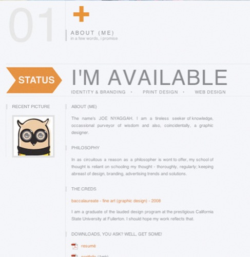
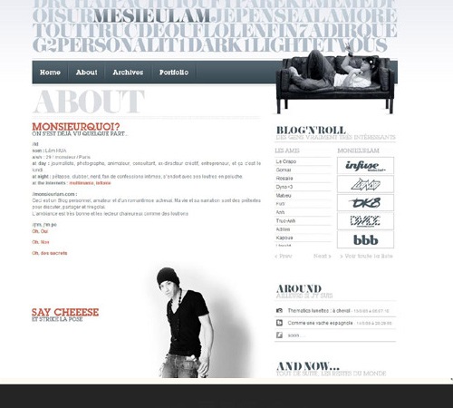
The designer used a grid layout in the layout of his About page. Contemporary colors inform you of the designer’s style, while a status message of his availability to take on new projects makes it clear to prospective clients whether he’s available or not.
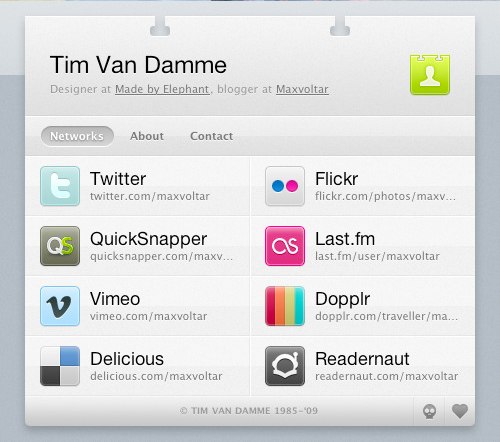
A unique and effective way of organizing your personal information on the web is to create an online business card (vCard). In doing so, we learn who the designer is, other places to connect with him, and how to get in touch with him.
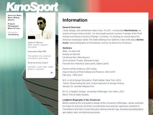
The About page for James A. Reeves is simple and modular, allowing for the large-scale photography in the background.
The artistic design of Janis’s website is very captivating. It gives you a glimpse into the designer’s personal aesthetic style, while supplying the information you need to hire him for your next project. The use of large photography can leave a lasting impression on the visitor if done effectively, as shown in this About page.

Here’s another example where the designer used a self-portrait in a unique and engaging way. Including a large self-portrait on your site gives a potential client a real person to relate with.

Jared Christensen used a humorous, catchy self-portrait on his About page to not only allude to his sense of humor, but also allow the client to see his creative side a little more personally.

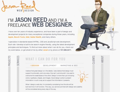
Jason Reed uses a nice illustration of himself in his About page. The use of an illustration is another way to grab the visitor’s attention and add a more character to your About page.
This designer organized his credentials in an easily digestible format. Large photography offsets the information and gives you an idea of the site owner’s style and influences.

On this website for a design studio, information is organized efficiently, both giving you an idea of their services while presenting attributes of the designers behind the company.

Here’s another striking About page. As you can see, the design is simple, but fun and illustrative.

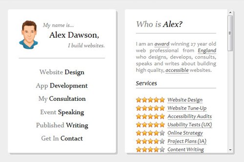
Alexander Dawson (a Six Revisions writer) presents his About page in a very efficient, functional manner. From looking at his credentials, you get a quick overview of who he is, what he does, and the services he excels in. It’s really all you can ask for from an "About me" page, right?
Through the use of a grid layout, Adam Dannaway achieves a simple, straightforward About page that also gives you an idea of his skills, illustrated as graphs.

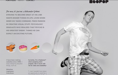
The About page for egopop presents a large-scale photo of the designer as well as a simple biographical statement about himself and his history as it relates to his profession.
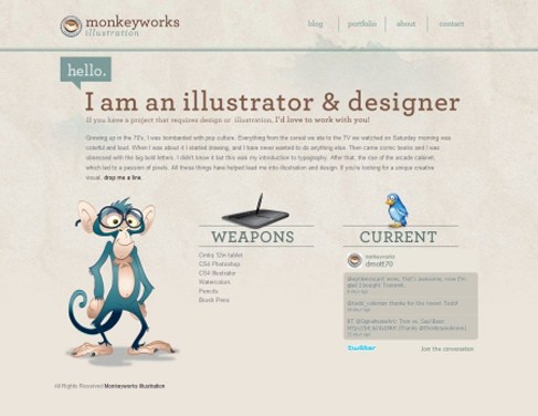
Monkeyworks uses a clean, structured layout on their About page. Not only are the illustrations captivating, but the typography stands out and the graphics used add a nice touch.
Great use of typography is what stands out in this "About me" page. Not only does the type make the page easy to read, the grid layout increases readability as well.

The designer took their About page to the next level by superimposing their face on Mount Rushmore. Tastefully done, this tactic adds a unique and memorable visual to an otherwise straightforward page.

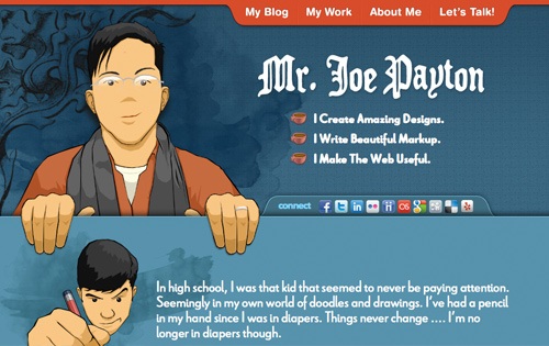
The About page of Joe Payton presents a short bio about him in a beautifully laid out format. The designer also presents information for following him on various social networking sites.
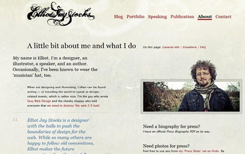
The About page of Elliot Jay Stocks is laid out rather simply, but the typography is carefully thought-out and makes you want to explore this designer’s work further. The designer, who is also a speaker and author, presents you with links to pertinent information related to his professional activities.
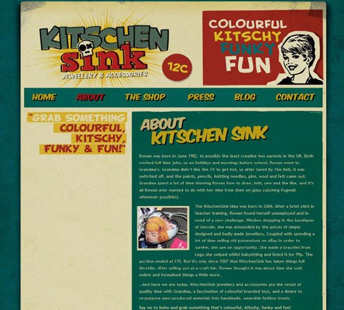
The compelling website for Kitschen Sink made me want to explore the About page. I found out that they’re a jewelry and accessories shop and I learned the history behind the company. Although it’s laid out very simply, captivating branding led me to the About page through curiosity.
Matt Mullenweg sets the backdrop for his About page on a highly textured background. These visual layers compelled me to read more about the founder of WordPress.

This beautiful About page features animations and depth to draw the visitor in. Clear typography and a monochromatic color scheme set this About page apart.

This designer’s About page is really simple and straightforward. It includes a short bio, links to relevant info, and her library. It’s always the neatly designed pages that attract me the most.

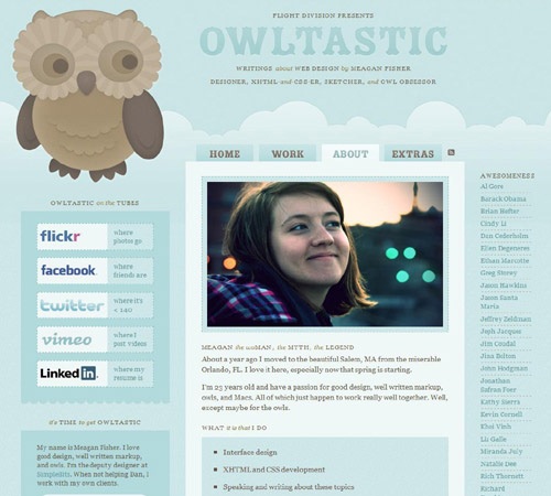
This beautiful About page of designer Meagan Fisher lets you know all the pertinent information about her and the services she provides. Included are links to social networks and other affiliated websites, all organized into a clean and inviting format.
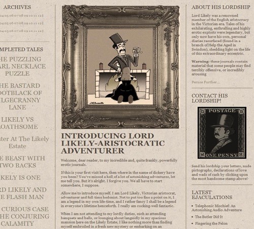
This compelling About page’s character is what draws the visitor in. Inspired by Victorian-era design, the designer implemented old-world style in creating a unique and professional page that serves as an introduction to himself.

This unique About page presents a timeline of the site owner’s life — from birth to his projected death.
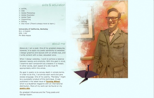
The beautiful watercolor illustrations grabbed my attention on this website. As you can see, his About page is laid out very simply and elegantly. We get a sense of his design influences, on top of his skills and education, through this clean and straightforward approach.
Large-scale photography is what sets this "About me" page apart. The page is laid out in a clear format, providing information about the designer and where he can be found.
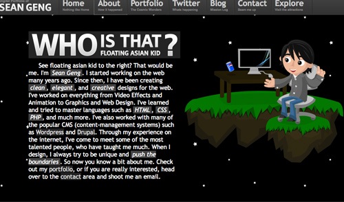
The interaction on this website intrigued me enough to explore its About page. You can see from his short biography what the designer specializes in and how to reach him.
| 빛과 어둠의 이해 도영상 (0) | 2011.09.25 |
|---|---|
| 함께 쓰면 실패하지 않는 영문 폰트조합들 (0) | 2011.04.27 |
| ppt발표 영감 (0) | 2011.03.16 |
| 로고 디자이너 70명의 트위터 (0) | 2011.03.16 |
| 디자인 자료 다운로드 가능한곳 영감 + 소스 등등 메거진도 있음 (0) | 2011.03.06 |
|
|
| 빛과 어둠의 이해 도영상 (0) | 2011.09.25 |
|---|---|
| 30가지 개인 자기소개서 사이트 (0) | 2011.05.26 |
| ppt발표 영감 (0) | 2011.03.16 |
| 로고 디자이너 70명의 트위터 (0) | 2011.03.16 |
| 디자인 자료 다운로드 가능한곳 영감 + 소스 등등 메거진도 있음 (0) | 2011.03.06 |

Stock.XCHNG은 외국 디자이너나 그래픽 유저들이 많이 사용하고, 추천하기도 하는 이미지 공유사이트로 잘 알려져 있습니다. 무료 이미지 공유 사이트 중 하나인 Stock.XCHNG의 이미지들은 모두 사용자가 직접 올린 것들이고, 매일 새로운 이미지들이 사용자에 의해서 업데이트 됩니다.
Stock.XCHNG는 이미지를 공개하기 전에 가입한 회원들이 올린 이미지가 품질 또는 해상도, 카테고리 등등 제대로 되었는지 운영자가 전송된 이미지를 하나씩 검사하기 때문에 이미지 검색 및 빠른 활용이 또 다른 매력 포인트로 볼 수 있겠습니다.
더군다나 Stock.XCHNG은 사용자 포럼과 커뮤니티 회원들의 활동이 활발하고 그들이 정기적으로 사이트에 등록하는 유용한 글과 튜토리얼을 담은 블로그를 통해서 의외의 디자인 스킬을 업그레이드 할 수 있다는 것이 특징입니다.
그리고 Stock.XCHNG에서 모든 이미지 다운로드할 때는 이미지 사용 라이센스에 동의해야하며, 회원가입 절차도 간단해 아무나 쉽게 이용할 수 있습니다. 풍부하고 다양한 이미지 소스가 잘 정리되어 있는 Stock.XCHNG의 디자인 소스들은 사용에 특별한 제약은 없으며 개인적 용도, 상업적 용도든 자유롭게 사용할 수 있습니다.


| 2011. 04.02 Saturday sun (0) | 2011.04.03 |
|---|---|
| 2011년 3월 30일 2일차 (0) | 2011.03.31 |
| 2011년 3원 29일 도착 첫째날 브리즈번 (2) | 2011.03.31 |
| 2011년 3월 28일 호주로 출국날 (0) | 2011.03.31 |

| 2011.4.3 sunday raining (0) | 2011.04.04 |
|---|---|
| 2011년 3월 30일 2일차 (0) | 2011.03.31 |
| 2011년 3원 29일 도착 첫째날 브리즈번 (2) | 2011.03.31 |
| 2011년 3월 28일 호주로 출국날 (0) | 2011.03.31 |
아침 8시 기상 씻고 바로 ㄱㄱㄱ
다른방사람들은 모두 잠들어있음...
우린 8시 반쯤에 바로 다 나옴 ... HK 이랑 JY 얼마나 나가고싶으면 그렇게 빨리 챙길수가있어... ㅋㅋ
아마 일어나면 없어져서 다들 놀래려나? ㅎㅎㅎ
근데 비가 억수로오네 헐...
이걸어째 ...기상청을 들여다보니 요번주 내내 비가온다네...
안갈수도없고... 잠깐 비가 그치길래 막 바로 나왔다.. ㄱㄱㄱㄱㄱㄱ
근데 엄청난 어제 올린사진중에 엄청오르막길있는곳을 그 무거운 캐리어 이것을 끌고가려니 장난아니군....
올라가다 보니 비가 온다.. 근데 사람들이 거의 우산을 안쓰고 다니다니... 여기는 원래 비가 많이와서 사람들이 우산 잘 안쓰고다닌단다..
사람들에서 버스어디서 뭐 타냐고 물어본뒤 일단 어제 왔던 로마스트리트역으로 ㄱㄱ
여기는 신기한 하나가 식당에 비둘기가 산다... 막 돌아다녀..이자식!! 내껀 뺏어먹지마 안때릴께...


여기서 나는 옵터스카드를 30달러에 사고 내 갤럿시K에 꼇다 후후후... 자 전화를 해볼까?? ㅋㅋㅋ
ㅋㅋ 그러나 전화안에서 뭐라뭐라 한다... 뭐라는거지.. 안들려 큰일 났다.. 내 영어실력 ㅋㅋㅋ
유심칩 산곳으로 다시가서 도움을 요청했다...아저씨가 너무나 잘도와주셨다.. 그런데 20분넘게 걸렸다 ㅎㅎㅎ
내가 그아저씨말을 너무 잘 못알아 들어서 아저씨도 헤매였던것!!
전화속의 상담원이 나에서 요구하는게 많았다 .. 지금 사는곳이 어디냐고.. 난 모르는데.. 골코에 살꺼라고했는데 주소를 알려달라기에
지도로 찾아서 알려달란다... 나는 처음에 집을 찾고있다고했다... fiding house ㅋㅋㅋㅋ 근데 이걸 듣더니 알았다며 잘 찾아보라고 ㅋㅋㅋㅋ
난 그게아니라 집을 찾고있다고 .. ㅋㅋㅋ 그래서 한참 말하다가 집이 없다니까 드디어 통과 휴... 원래 이거 이렇게 안어려울텐데..
어째뜬 옵터스 가입 성공!! 굿...
근데 헐 인터넷 500메가나 주다니.. 오호 !!! 나중에 안거지만 ㅋㅋ
근데 한국보다 빨리달아 ㅠㅠ
내 도돌에서는 분명히 2메가 썻다고 나오는데 확인해보니 벌써 14메가를 쓴걸로나오다니 ,,,
그리고 오늘 방금 이글을 쓰다가 알아낸 정보 이거 다쓰기전에 10달러주고 인터네셔날 zoneA 로 충전하면 한국으로 200분전화할수있단다 우와 좋다..
바로 HK에게 전화해서 알려줬다 ㅋㅋ 좋은정보는 공유.. 나도 내일 가서 해야지.. 여기 인터넷 후져서 스카이프 끊겨...

여기는 골코가는 전철의 사람들
그리고 오늘 다시발견한 사람들을 위한 버튼 우리나라도 비상멈춤이있지만 이거는 설명안해도 되게 편하게 되어있다...

여차여차 골든코스트에 도착 왔는데 버스타고 환승하고 힘들었다.. 그러나 쉐어 구한데가 완전 좋다... 우와 어제 너무 이상한데서 자서그런지 천국..
브리즈번에 있는 애들이 있는 곳도 엄청나단다 ㅎㅎ 잘됬다.. 여긴 수영장도 있다구 ㅋㅋ 나 개인방구했어 우왓 ㅎㅎㅎ 근데 방 잠그는게 없네 ㅎㅎㅎ
내일은 이주변 사진좀 찍고 돌아다녀야겠다... 집은 내일올려야지 ㅎㅎㅎㅎ
서비스 (내랑역)


| 2011.4.3 sunday raining (0) | 2011.04.04 |
|---|---|
| 2011. 04.02 Saturday sun (0) | 2011.04.03 |
| 2011년 3원 29일 도착 첫째날 브리즈번 (2) | 2011.03.31 |
| 2011년 3월 28일 호주로 출국날 (0) | 2011.03.31 |
도착한 첫날... 일단 화장실부터 갔다..
내가 생각했던것 보다는 엄청나게 선진문화가 완성이되어있느것 같진 않았다.
화장실이 무지 깨끗하진 않았다.. 그러나 브리즈번 공항에 엄청난걸 발견!!ㅇ.ㅇ


사람이 쓰고 돌리면 다 안쓴부분으로 감긴다.. 아마 다 감기면 세탁을하나??
이해가 가려나... 모르면 나에게 Call or 카톡 or 스카이프?
우리나라보다 일단 환경에대한 인식은 앞선것처럼 보였다... 어째뜬 좋은 발견..
여기는 브리브번 공항에서 3층으로 올라간뒤 건너편에있는 공항철도.. 이걸타고 일단


전철에 또 엄청난걸 발견!!! 우리나라도 이렇게했으면 좋겠음 ...그러나 우리나라는 전철에 사람이 너무 많아서 아마 안될듯...
그래도 조금이나마 이렇게 환경을 생각한다니... 멋지다...

전철에서 내리려면 버튼을 눌러야 문이 열린다... 그렇지 않으면 역에서 정차를 하긴하지만 문이 열리지 않는다.. 전기 아끼는거지 뭐 ㅎㅎㅎ
첫쨋날 머무는 곳 근처의 사진이다...


이날은 완전 난 캠프를 했다...거의 밖에서 잔듯... 싸긴한것 같은데... 이불은 언제 빤지도 모르겠고 너무 더럽고 씻는게 짜증날정도로
화장실도 더럽고 .. 대체 여기서 어떻게 지내는거야...
그런데 거기 들어오신 어떤분이 나보고 이런가격에 잘들어왔다고 ㅠㅠ 헐..
어차피 하루만에 나갈껀데 뭐 ㅎㅎㅎㅎ 잠도안와 침대가 너무 물렁해 스프링이 다 느껴져 ㅋㅋㅋ
내 친구들도 다 내일 나간다고 한다..아침일찍 ㄱㄱㄱ
여기는 사진 찍기도 아까워서 안찍음.. 주위 풍경만 무지 멋있었다..
밥을 먹으려고 했는데 엄청나게 비싸다.. 콜라 1.5리터가 3.5달러? 1달러가 대략 1150원쯤 이었음
뭐하나 집으면 몇달러가 퐉퐉 ㅎㅎㅎ
그런데 거기 직원이 우리가 불쌍했는지 큰 마트를하나 소개시켜줬다.. 일단 가보자..
엇 그런데 엄청나게 싼것도 많았다 세명이 만원안쪽으로 해결가능 오오오오오
2.5리터 정도되어보이는 오렌지 쥬스가 2달러 헐 한국보다 싼듯?? 이거 하나랑 식빵이랑 소세지 묶음을 샀지 소스하나하구 ㅋㅋ
근데 9달러 안나왔다 ..ㅋㅋ
신나서 쉐어 들어가자마자 먹었지 토스트기에 구워서 ㅋㅋㅋㅋ
근데 헐 소세지가 무지짜... 반만 먹었지 ㅋㅋㅋ
참 마트에서 고기 보니까 완전 엄청나게큰 덩어리고기가있는데 10달러 조금넘었다.. 우리나라에서 그만한거 사려면 아마도 20만원은
넘게 줘야되지 않나 싶다.. 근데 여기는 만원조금 넘어. 헐 요리가능한데로 가면 무조건 고기만 먹어야겠다...
하튼 얼릉 내일이와서 ㄱㄱ해야지
서비스 ( 원하면 바로 지워드림 ㅎ.ㅎ)

| 2011.4.3 sunday raining (0) | 2011.04.04 |
|---|---|
| 2011. 04.02 Saturday sun (0) | 2011.04.03 |
| 2011년 3월 30일 2일차 (0) | 2011.03.31 |
| 2011년 3월 28일 호주로 출국날 (0) | 2011.03.31 |


헐헐 ㅋㅋㅋ

왠지 비행기에서도 한방은 남겨놔야할것같은기분에 달랑한장 ㅋㅋㅋ 사진 돌리는법을 찾아야겠어...

캐시피 퍼시픽? 요거타고 홍콩까지 갔다.. 홍콩에서 5시간 머물렀는데 사진이 달랑한장... ㅋㅋ
여기서는 홍콩돈도 없고 미국달러도 없어서 완전 굶을 뻔했다..
그러나~!!! JY가 미화가 약 100달러정도있었나보다.. 3원28일 현재에는 미달러가 1달러당 약 1100원이었고
홍콩달러가 142원이었다.. 이걸모른 우리는 아무것도 살수가없었다... 음료수가 20달러가 넘었으니까... 도대체 저기 사먹는 외국인들은
모두들 엄청난 갑부처럼 보였다.. 그런데 잘되지도않는 폰 인터넷으로 와이파이 간신히 잡아가며 검색해보니 글쎄 홍콩달러는 미국달러랑
저렇게 차이가 많이나다니... 완전 속았다...
내가 그래도 비싸다.. 그래서 아이스크림 두개랑 비타민워터 한개를 사서 나누어 먹었지.. 근데 너무 달다며 먹지를 않아!! 내가 다먹으려 했으나
다 녹았다.. 슬러쉬(?) 헐 ㅎㅎㅎㅎ
홍콩 인터넷 역시 중국... 씁 ㅋㅋㅋㅋ 공항이 이렇게 느려도됨???
나 영어 무지 못함.. 근데 홍콩사람도 못하는듯??? 아닌가? 하긴 잘하시는데 발음이 ... 나보단 좋은것 같긴하지만.. 외국인하고 소통이 안되시는
인포메이션 직원분도.. 분명히 그 외국인 영어 쓰고있었는데...
난 원래 사진 보정안하고올림 ㅎㅎㅎ
그 엄청난 5시간의 홍콩시간을 마치고 드디어 호주로가는 콴타스 비행기를 탔지 ㅋㅋㅋ
이제 10시간넘게 타야되다니.. ㅋㅋㅋ
비행기 좌석이 딱 네자리씩 있었다.. 그런데 우린 3명 누군가는 모르는사람 옆자리 나가지도 못하고 옴짤달싹 못하게 생겼다... ㅋ
옷~!! 그런데 다행이다.. 우리자리만 3자리다.. 멋지다... 불편하지않아~!!! 하고 자리에 앉았다..
그런데 이런~!! 내자리 다리를 뻗을수있는공간 오른쪽이 막혀있었다.. 머야 !! 헐~ 10시간 넘게 가야된다구...
덕분에 무지 힘들었다 ㅎㅎㅎ 새벽에 잠이안와서 비행기 안에 돌아다녔어 .....ㅇㅇ 무지 피곤 ㅜ-
JY이 옆한칸 떨어져있던 외국인분은 혼자앉으셨는데 정은이가 그렇게 귀여웠나보다... 엄청나게 친절을 배푸시더라 완전 .. ㅋㅋㅋ
깜짝놀랬음... 관심있는줄 착각할정도로 잘해줘서.. 후드를 쓰고있었는데 귀엽게 봤나보다 ㅋㅋㅋ
두장은 서비스 철도공항인데 왠지 찍고싶었음... 지우라면 바로 삭제하겠음


| 2011.4.3 sunday raining (0) | 2011.04.04 |
|---|---|
| 2011. 04.02 Saturday sun (0) | 2011.04.03 |
| 2011년 3월 30일 2일차 (0) | 2011.03.31 |
| 2011년 3원 29일 도착 첫째날 브리즈번 (2) | 2011.03.31 |
| 30가지 개인 자기소개서 사이트 (0) | 2011.05.26 |
|---|---|
| 함께 쓰면 실패하지 않는 영문 폰트조합들 (0) | 2011.04.27 |
| 로고 디자이너 70명의 트위터 (0) | 2011.03.16 |
| 디자인 자료 다운로드 가능한곳 영감 + 소스 등등 메거진도 있음 (0) | 2011.03.06 |
| 디자인 잡지에 실린 "함께 쓰면 실패하지 않는 영문폰트 (0) | 2011.02.27 |
 by 앗뜨거 |
||


|
| 일 | 월 | 화 | 수 | 목 | 금 | 토 |
|---|---|---|---|---|---|---|
| 1 | 2 | 3 | 4 | 5 | 6 | |
| 7 | 8 | 9 | 10 | 11 | 12 | 13 |
| 14 | 15 | 16 | 17 | 18 | 19 | 20 |
| 21 | 22 | 23 | 24 | 25 | 26 | 27 |
| 28 | 29 | 30 |
